5 Charts zur Bewertung der US-Börse
Auch 2017 werden wir uns an dieser Stelle neben den makroökonomischen Themen mit den Finanzmärkten befassen. Darum gleich zu Beginn die Erinnerung: die Geldpolitik/der gestern diskutierte Schuldenzyklus haben zu einer signifikanten Bewertung an den Finanzmärkten geführt. John Mauldin zeigt das nochmals, hier via Zero Hedge.
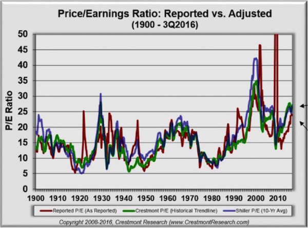
Zunächst das klassische Kurs-Gewinn-Verhältnis:
Quelle: Mauldin/Zero Hedge
- “The red line is the combined P/E ratio of the S&P 500 as originally reported. The green and blue lines are adjusted Crestmont and Shiller versions, which occasionally diverge. The P/E ratio spent most of the last century between 10 and 25. Presently, all three P/E versions are near or above 25, indicating overvaluation. This doesn’t mean the end is near. But it does suggest that we are not at the beginning of another long-term bull market.” – bto: Das kann man ganz sicher so sehen.
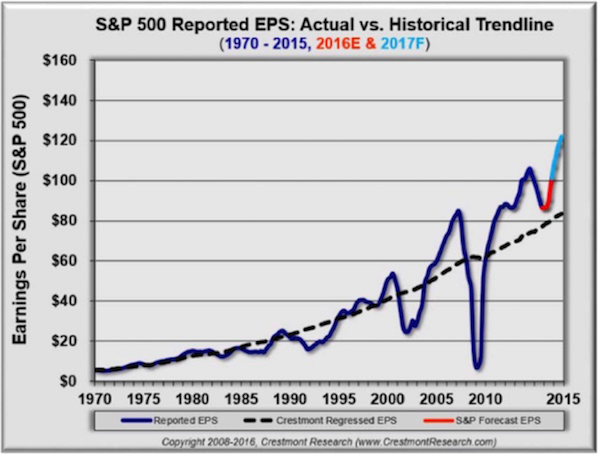
Dann der langfristige Trend der Unternehmensgewinne:
Quelle: Mauldin/Zero Hedge
- “Reported earnings per share go below the baseline during bear markets and above it in bullish periods. Currently, it is way above trend and is projected by S&P and many others on Wall Street to become even more so.” – bto: und zwar deutlich!
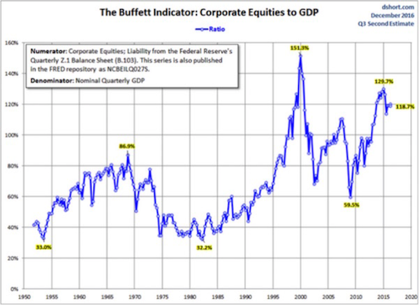
- “The Buffett Indicator is essentially the market value of all publicly traded securities as a percentage of GDP. Intuitively, it seems odd that the combined value of every public stock would be worth more than the country’s annual production. But sometimes it is. Those periods tend to mark overvaluation, as you can see here.” – bto: noch nicht 1999 aber doch deutlich.
Quelle: Mauldin/Zero Hedge
- “The interesting thing here is that right now, the Buffett Indicator—while down from its late 2014 peak—is still higher than it was before the 2008 financial crisis. That should not be encouraging if you’re a bull.” – bto: wobei es lange abweichen kann vom normalen Wert.
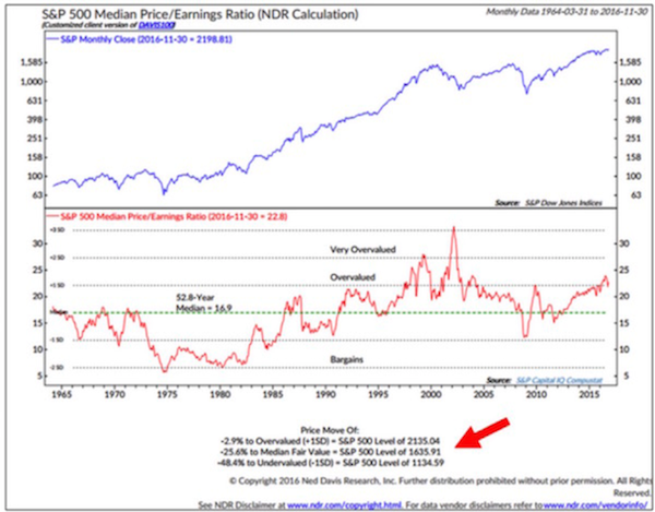
- “The next chart is from Ned Davis and shows us the S&P 500 median P/E back to 1964, which is 16.9 (dotted green line). The distance we are above or below the median is a valuation clue.” – bto: und zwar wiederum auf Überbewertung.
Quelle: Mauldin/Zero Hedge
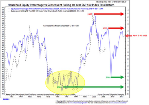
- “The following chart takes some explaining. It shows the percentage of household financial assets invested in stocks (blue line) versus the S&P 500 total return for the following 10 years (dotted line).” – bto: weshalb wenig zu erwarten ist.
Quelle: Mauldin/Zero Hedge
- “Notice that the right axis is inverted and the dotted line tracks pretty close to the solid blue one. The correlation is 0.91, which is extraordinarily high. What the chart shows us is that a higher percentage of household assets in equities points to a lower annualized return over the next 10 years.” – bto: Das habe ich schon mehrfach hier gezeigt.
- “The bad news is that the red arrow at 6-30-2016 means that the 10 years ending 6-30-2026 should produce a 3.25% annual gain.” – bto: was schon toll wäre!
→ Zero Hedge: “6 Charts That Make The Case We Are In Long-Term Secular Bear”, 23. Dezember 2016


