War das der Melt-up-Boom?
Vor ziemlich genau zwei Jahren habe ich mich bei der WirtschaftsWoche und an dieser Stelle mit dem “Melt-up”-Boom beschäftigt:
→ Das Gerede vom „Melt-up“-Boom
Grundlage bildeten damals die Überlegungen von Jeremy Grantham von GMO. Diese fasste ich so zusammen:
“Jeremy Grantham vom Bostoner Vermögensverwalter GMO hat sich die Mühe gemacht und die Charaktermerkmale früherer Blasen analysiert und auf die heutige Situation übertragen. Kernergebnis: Obwohl die Börse schon heute so teuer ist wie vor dem Börsenkrach 1929 – nur in der Dotcom-Blase war die Bewertung an der Wall Street noch höher – könnte es durchaus sein, dass die Märkte in den nächsten 21 Monaten nochmals 60 Prozent zulegen. Kursziel wären damit bis zu 3700 Punkte im S&P 500. Allen Blasen ist nämlich gemein, dass sie mit einem „Melt-up“ enden.
Diese Aussage ist umso bemerkenswerter, weil sie von einem anerkannten Bären, also einem Börsenpessimisten kommt. Schon seit Jahren warnt der Vermögensverwalter vor der zu hohen Bewertung an faktisch allen Finanzmärkten und prognostiziert auf lange Sicht nur noch maue Renditen. Für ihn als Value Investor ist schon heute alles zu teuer, er räumt aber ein, dass die Märkte sich länger und deutlicher vom fairen Wert entfernen können. Es wäre immerhin die dritte Blase innerhalb von zwanzig Jahren.”
Blicken wir auf den S&P-Stand zum Jahreswechsel, so muss man festhalten, dass wir einen guten Teil des Weges schon zurückgelegt haben. Mit rund 3225 zu Weihnachten 2019 (als ich diesen Beitrag verfasste) fehlen nur noch gut 15 Prozent und das von Grantham für den Melt-up anvisierte Ziel wäre erreicht.
Führt zur Frage: Platzt dann die Blase (wenn es überhaupt eine ist)?
John Authers von Bloomberg spricht in seinem Newsletter ebenfalls vom Melt-up und führt den vor allem auf das billige Geld zurück:
- “I have been arguing for many years that U.S. stocks are expensive, and they have continued rallying regardless. Are they really too expensive, and if so does it matter? (…) I pointed out that all of 2019’s gains came from expanding price-earnings multiples, and that even on basic measures like price-book and prospective P/E ratios, the U.S. looked as expensive as it had done since the dot-com bubble.” – bto: Natürlich weiß man, dass die Zinsen seither deutlich gesunken sind.
- “These statements were true, but here are some arguments against. Earnings per share indeed declined in 2019, while P/E multiples surged ahead, but a lot of this was driven by the dramatic sell-off at the end of last year. Jonathan Golub, U.S. equity strategist at Credit Suisse Group AG, points out that since the beginning of last year, share prices have risen roughly in line with earnings, which received a one-off positive shock from the tax reform law:” – bto: Doch kann man seit Herbst eine gegenläufige Entwicklung sehen. Blau und Lila gehen zurück und die Märkte stark nach oben.
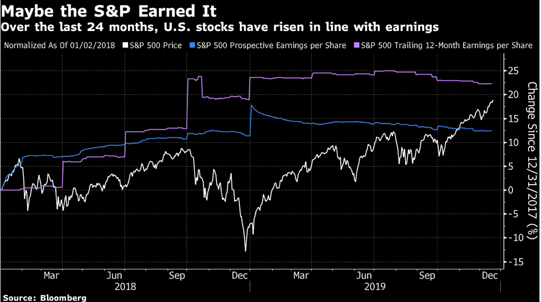
Quelle: Bloomberg
- “Equities may look expensive relative to their own earning potential, but if you sell them you need to buy something else. Are they any more pricey than the alternatives? The bond market is of course expensive. Rather than look at government bonds, which are subject to direct manipulation, Bespoke Investment Group tried comparing earnings yields (the inverse of the P/E) on stocks to the equivalent yield on high-quality corporate bonds (as measured by Moody’s AAA and BAA). This suggests that stocks are exactly in the middle of their historical range.” – bto: Oder wird beides gleichermaßen überbewertet?
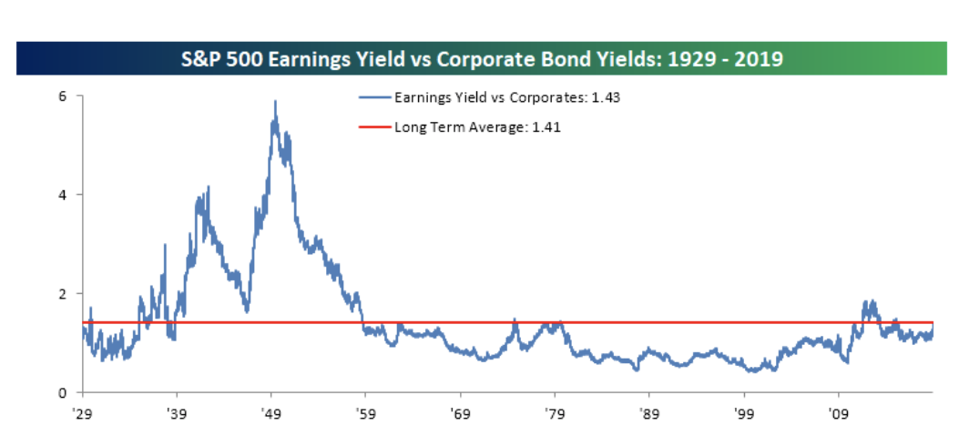
Quelle: Bloomberg
- “The biggest issue with this measure is that it peaked in the early 1950s, which turned out to be a great time to buy stocks. It continued to fall and then flatlined for years after the start of the 1982 bull market. So it has no obvious track record of spotting buying opportunities. The steady reduction in the supply of AAA-rated and other high-quality credits, as companies borrow more, might also mean that corporate bonds have grown defensibly more expensive. They are rarer now, and people pay for scarcity. But again, the point stands that equities don’t look expensive compared to fixed-income investments.” – bto: Aber wir wissen, dass es nicht wenige Anleihen gibt, die kurz vor der Herabstufung stehen.
- “Now we come to the most contentious measure of them all. The cyclically adjusted price-earnings ratio, or CAPE,(…) CAPE accurately showed that it was time to sell at the top in 2000, and that there was reason to suspect the rally that ended in the 2008 crisis. But it has been showing stocks to be overpriced for many years now, as the market has risen. Any number of critics are suggesting that the indicator is broken, or that it needs to be revised.” – bto: Er mag nicht zum Timen des Marktes dienen, aber man kann sicherlich sagen, dass eine hohe Bewertung geringe künftige Erträge impliziert.
- “Shiller eschewed any radical changes, but he did start to publish a new “total return” version of CAPE, which takes account of dividends and share buybacks. It is shown in green below. It also isn’t controversial that lower interest rates should, all else equal, justify higher stock multiples, and so he always publishes his chart with a measure of long-term rates. Here it is, with the new ‘total return’ CAPE in green:” – bto: na ja. Man könnte durchaus sagen, dass die tieferen Zinsen geringeres künftiges Wachstum signalisieren und man deshalb keine höheren Multiples zahlen sollte. Die Abbildung zeigt aber, dass es zu den Höchstständen von 1929 und 2000 noch ein Weg ist. Der Boom könnte also weiter gehen!
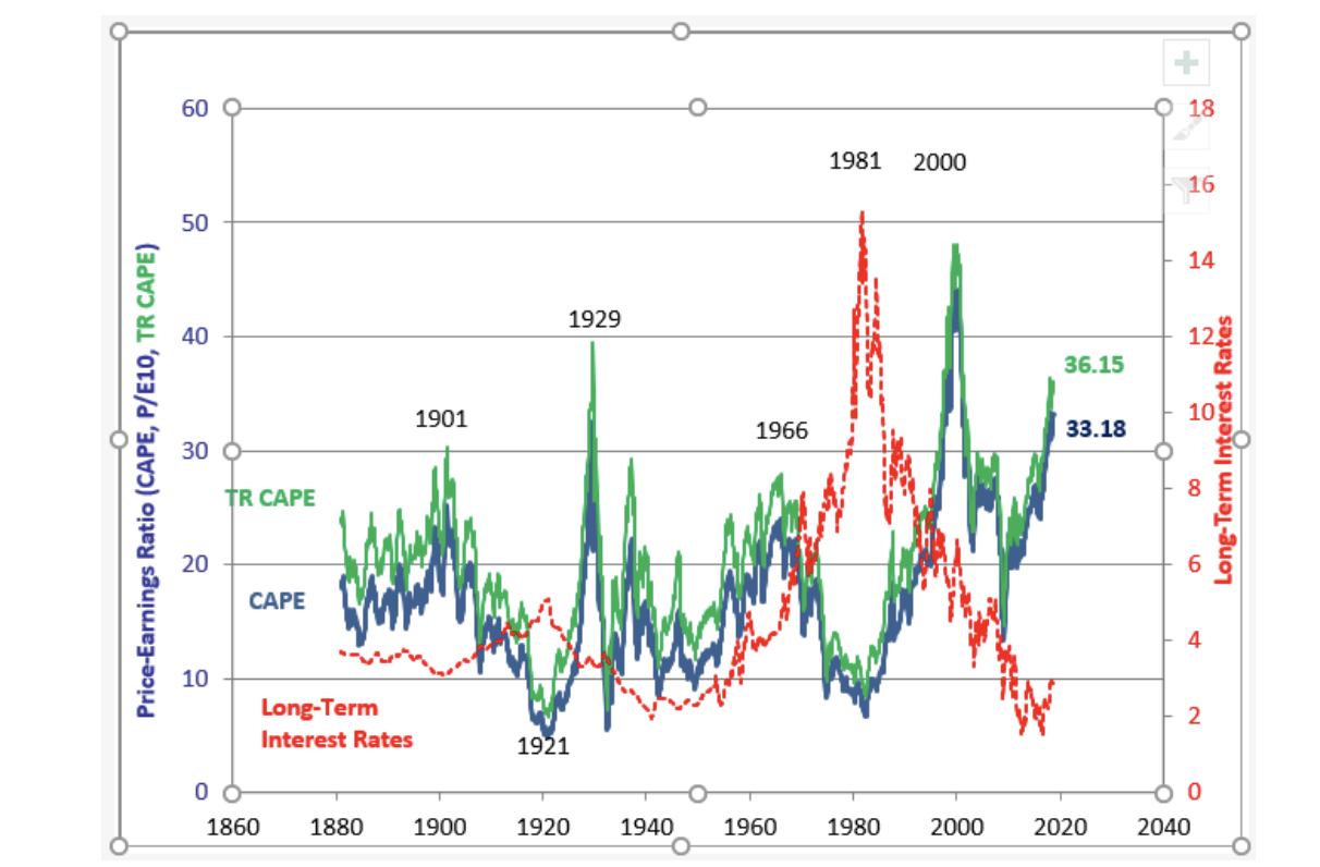
Quelle: Bloomberg
- “The total return version does appear more sensible. On this basis, stocks are still less expensive than they were on the eve of the Great Crash of 1929, which isn’t true of the standard CAPE. We can also see plainly that rates are very low, and that share prices are very expensive. The worst of the earnings depression of 2008-09 has now dropped out of the 10-year average on which the CAPE is based. So it seems to me that we should still take this as a serious warning. Buying U.S. stocks is effectively placing a lot of hope in the belief that rates will stay low.” – bto: Und das ist doch die Wette, die seit Jahren läuft: immer weiter in das Zinstal der Eiszeit. Fragt sich nur, wie das mit steigenden Aktien zusammenpasst?
Die offensichtliche Frage: Wie lange geht der Melt-up-Boom noch weiter? Morgan Stanley meint bis April/Mai, so zumindest bei Zero Hedge zitiert:
Es beginnt mit dem Hinweis, dass die Notenbanken so aggressiv sind, als wären wir schon in einer Krise:
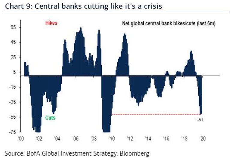
Quelle: Zero Hedge, BofA
Es zeigt, dass wir uns dem Endspiel nähern. Denn was soll erst passieren, wenn die Rezession kommt?
Vor allem wenn die Börse so am billigen Geld hängt: “since the launch of the Feds’ ‘NOT QE’ on Oct 11, every week that the Fed’s balance sheet has risen, so has the S&P500 … and vice versa, on the one occasion the two contracted together.” – bto: klar ersichtlich aus diesem Chart:
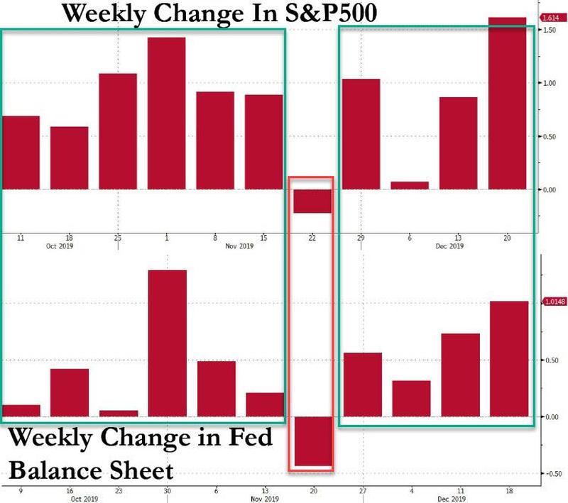
Quelle: Zero Hedge
Dazu dann Zero Hedge: “Extrapolating this unprecedented correlation, means that as long as the Fed’s balance sheet is rising, so will the S&P500.Putting this all together reveals the following picture:
- The Fed will continue to inject anywhere between $60-100 billion each month through Bill purchases and repos, with a burst of liquidity injections taking place now through mid-January.
- Every week that the Fed’s balance sheet increases, so does the market, and vice versa.
- The Fed’s Balance Sheet will continue to increase for at least another 4-5 months.
What does this mean for stock prices? Well, unless something drastic changes in the next few weeks, it likely means that the ‘supernova market’ forecast by BofA’s Michael Hartnett, which sees the S&P hitting 3,333 by 3/3 (March 3), may prove conservative.”
“Morgan Stanley echoes this worry, and in the year’s final report by the bank’s cross-asset expert Andrew Sheets, he writes that the bank’s interest rate strategists ‘expect the Fed to expand its balance sheet through April/May.’ That also roughly coincides with BofA’s 3,333 target which will mark the market top for the current cycle. What happens then? Here’s Morgan Stanley again: After that, markets may once again have to confront a world with limited trade progress and no further Fed support.” – bto: Diese 3.333 sind ja noch konservativ im Vergleich mit den 3.700, die GMO vor zwei Jahren genannt hat. So oder so ist klar, dass die Liquidität der Fed einen abnehmenden Grenznutzen hat. Es geht nicht nur um die absolute, sondern auch um die relative Veränderung.
Zero Hedge mit einem nicht so unrealistischen Fazit: “As such while we agree that the market meltup may continue until April or May, we are not so sure the Fed will no longer support it beyond that date; after all, the economy is now the market, and while a garden variety bear market would ensure a recession, a crash such as the one needed to wipe out the central bank excesses of the past decade, would result in the biggest global depression ever. Which is why the status quo will never allow it to happen, and such a ‘market event’ would only be possible in a time of great social and political upheaval.” – bto: Das wirft die Frage auf, ob man es überhaupt auf Dauer verhindern kann?