“Don’t Trust Inequality Data: A Lesson From The UK”
Neben dem “Klimaleugner” dürfte nur noch der “Ungerechtigkeitsleugner” ein ähnlich gesellschaftsschädlicher Zeitgenosse sein. Insofern bin ich bei bto natürlich in einer gefährlichen Umgebung, denke ich doch, dass wir es mit Technologie und nicht mit Verboten schaffen werden, den CO2-Ausstoß zu senken. Außerdem meine ich, dass die Ungleichheit bei uns nicht das große Problem ist, denn Umverteilung wirkt und ist – mit Blick auf die Vermögen – unserer Geldordnung geschuldet. Diese führt zu einer Assetpreisinflation, an der naturgemäß nur jene teilhaben, die über Assets verfügen.
Das habe ich bereits mehrfach in meinen Kommentaren zu Piketty erläutert und auch in meinem kleinen Büchlein
→ “Die Schulden im 21. Jahrhundert”
Danach ist offensichtlich, dass mit dem Vermögensanstieg ein enormer Anstieg des Leverages einhergeht. Die Schulden treiben die Vermögenswerte, was vor allem bei Immobilienpreisen funktioniert.
Doch auch so sind die Daten zur Ungleichheit immer mit Vorsicht zu genießen, wie dieses Beispiel von Großbritannien zeigt:
- “Inequality in the U.K., (Piketty) claimed, was on the rebound since 1980, and Thatcher’s tax policies were to blame. (…) As he writes in Capital, In Britain, the upper decile’s [wealth] share fell from more than 90 percent on the eve of World War I to 60-65 percent in the 1970s; it is currently around 70 percent. The top centile’s share collapsed in the wake of the twentieth century’s shocks, falling from nearly 70 percent in 1910-1920 to barely more than 20 percent in 1970-1980, then rising to 25-30 percent today.” – bto: Also wird behauptet, weil die Steuern gesenkt wurden, wurden die Reichen reicher. Die Wahrheit ist natürlich, dass damals der Assetboom begann, mit Schulden!
- “Piketty presented an array of data purporting to prove this pattern, including a visually appealing chart that showed the visible dip and rebound in top wealth concentrations. The applicable portions of that chart may be seen below, with a U-shaped pattern appearing in the 1980s.” – bto: Diese Bilder produziert er für alle relevanten Länder:
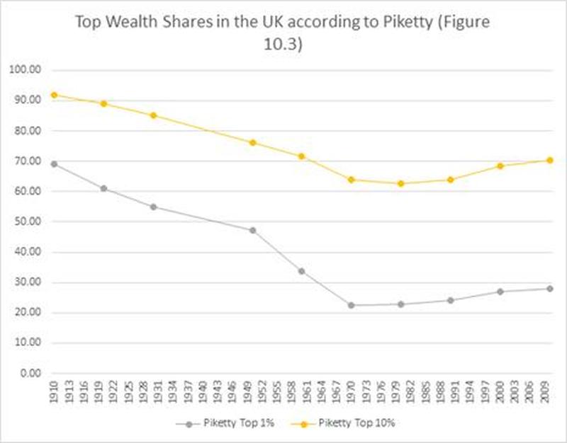
Quelle: Zerohedge
- “The Financial Times published a lengthy criticism of Piketty’s data (which he partially rebutted in an online rejoinder). I also published a replication study of Piketty’s U.S. statistics with Bob Murphy, showing that Piketty’s data construction tended to accentuate the American U-curve by pivoting between disparate data sources. Subsequent works by other scholars have confirmed as much, prompting additional scrutiny around his narrative for the United States.” – bto: Der Hauptpunkt ist der Immobilienbereich, der wie kein anderer davon profitiert, dass man mit Kredit arbeiten kann.
- “His graph, as depicted above, looks almost nothing like the source statistics he used to construct it. To see what was going on I conducted another replication analysis, the results of which were recently published in Social Science Quarterly. My chart comparing Piketty’s estimates against his source statistics may be seen below.” – bto: Diese Kritik ist nicht neu, aber berechtigt. Piketty geht mit den Daten äußerst großzügig um, damit es zu dem gewünschten Ergebnis führt.

Quelle: Zerohedge
- “Piketty’s graphs for both the top 1 percent and top 10 percent wealth shares show an inequality decline that takes place circa 1970, slightly ahead of the actual trough in the raw statistics. Second, the inequality rebound that appears on Piketty’s chart is not at all apparent in its raw data sources. His top 10 percent share in particular appears to severely overstate the raw data after 1980. (…) Piketty appears to have adjusted his series upward at the exact moment the Thatcher tax reforms took effect. Additional work has been done on the U.K.’s wealth concentration since Piketty’s book came out, including a 2018 study (Alvaredo et al. 2018) by a group of authors who are politically sympathetic to Piketty’s larger project. Their results also diverge from his narrative, as may be seen in the chart below, where they are overlaid with the same raw statistics that Piketty claims to have used.” – bto: was nicht neu ist. Piketty hat sich die Daten hingebogen, wie er es wollte. Dies ändert nichts an der Tatsache, dass die Politik – wie schon in meinem Büchlein vermutet – nur zu gern auf das Thema springt.
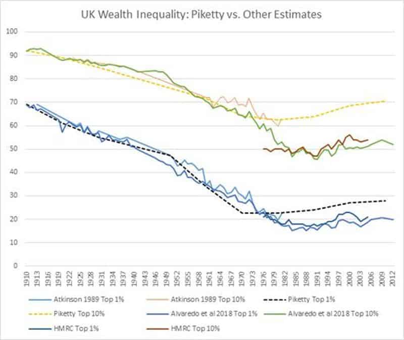
Quelle: Zerohedge
- “As can be seen in this comparison as well, the inequality rebound from Piketty’s chart is not at all apparent in any of the source data. Rather, it flattens out around the start of Thatcher’s term and, subject to a few small fluctuations in between that mostly post-date her government, remains on par with its 1980 level today.” – bto: Dummerweise kann man daraus nicht das Programm der hohen Besteuerung ableiten. Egal, macht man trotzdem.
- “The cause of the sharp divergence between the Piketty numbers and reality may never be fully known as he did not publish his original calculations. They do clearly skew in the direction of increasing inequality though, and in a way that is very convenient to his political narrative about the effects of the Thatcher tax reforms.” – bto: Piketty hat – so analysiere auch ich das in meinem Buch – vom gewünschten Ergebnis her analysiert und die Daten so ausgesucht. Kann man machen, sollte es aber nicht als Wissenschaft verkaufen.
- “The zeal for a higher and more progressive tax structure is strong in many corners of the inequality literature. Allowing that zeal to distort our statistical measures of wealth concentration is not only poor social science, but a political corruption of empirical analysis to the service of a prescriptive end.” – bto: So ist es. Wird aber die hiesigen Politiker nicht daran hindern, entsprechend zu argumentieren.
→ zerohedge.com: “Don’t Trust Inequality Data: A Lesson From The UK”, 29. Mai 2019